
The Crave Halmis brandinga bold Korean BBQ brand with a side of grandma’s spicy attitude
Crave Halmis is a Korean BBQ-in-a-bowl restaurant in California, serving up bold Korean flavours in a casual, fast-casual setting. At the heart of the brand is a familiar face: a sassy Korean grandma, brought to life in a punchy visual identity.
The K-BBQ’d brief
Crave Halmis wanted a distinctive identity for its new Korean fast-casual food concept, with a personality as bold as the flavours on the menu.
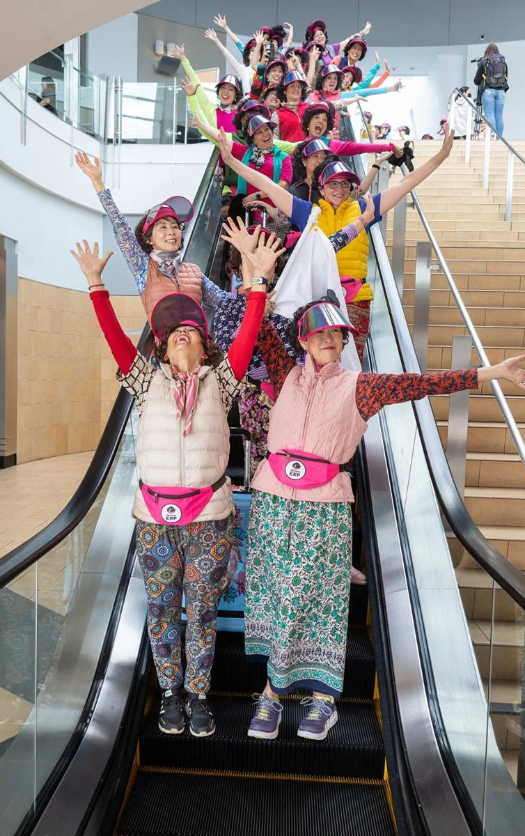
The idea centred around a tough-love Korean grandma, taking inspiration from the client's own halmi (grandma), a sweet but no-nonsense lady.
A familiar face with a fresh new attitude
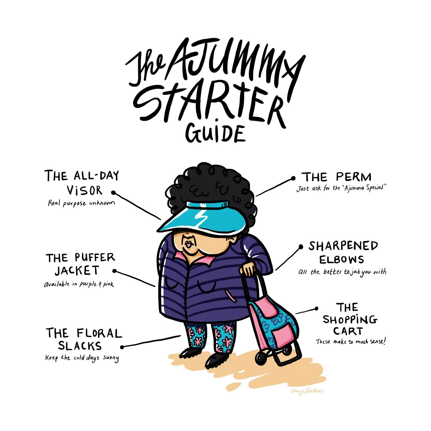
This character actually had a bit of history with me. Almost a decade ago, while living in South Korea, I created an illustration of a typical ajumma (a Korean middle-aged woman) that still pops up on Google when you search the term. The client stumbled across it, loved how it reminded her of her own halmi, and tracked me down to bring that same personality to her new brand.
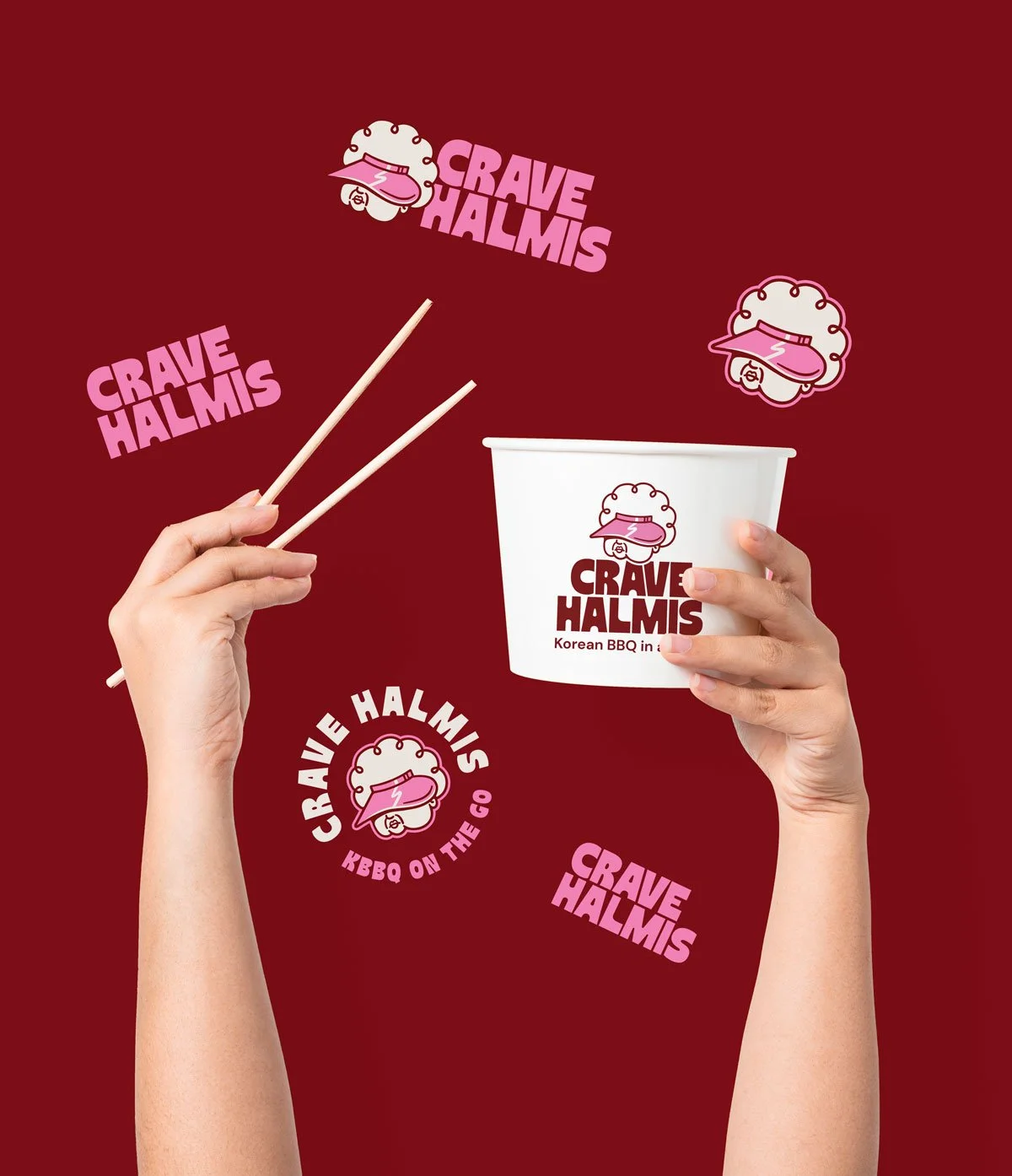
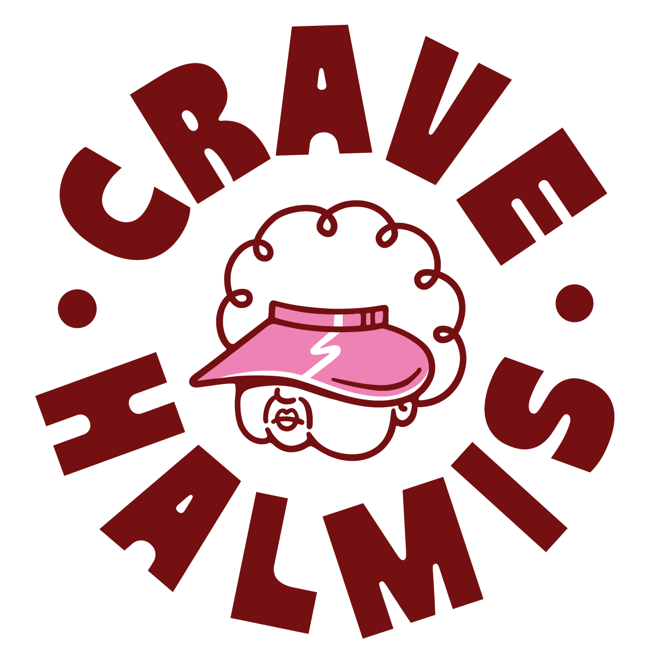
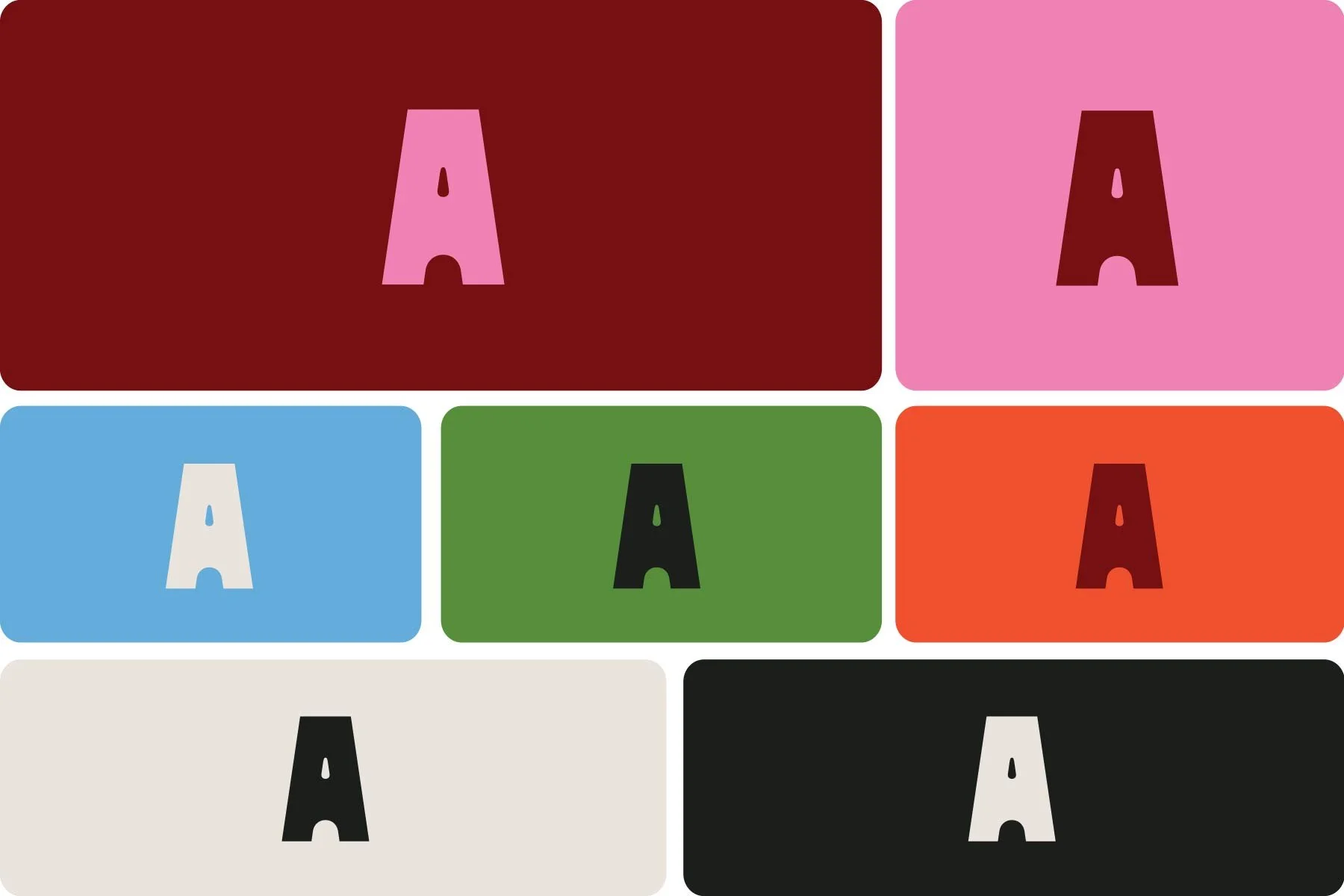
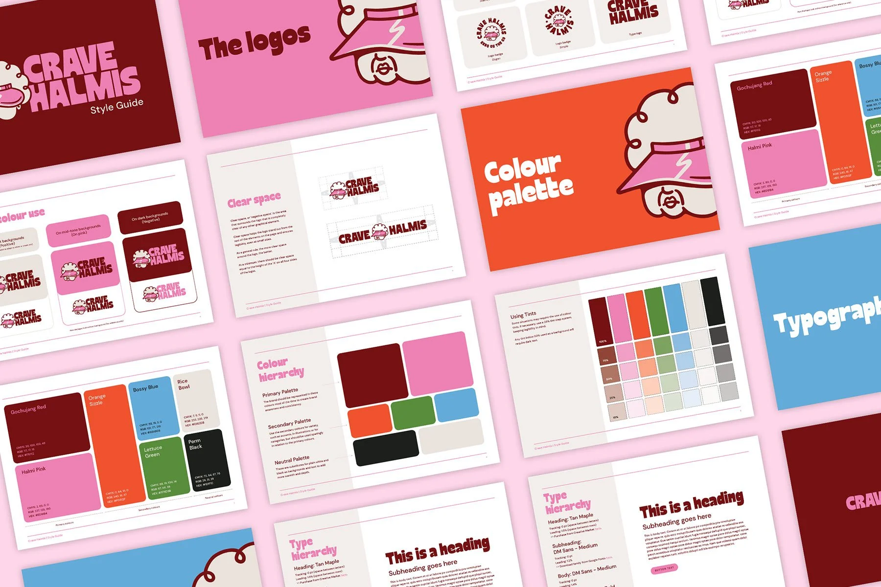
We took that original inspiration and gave her a fresh lease on life as Crave Halmis' brand icon. Think hot pink inspired by the bold outfits ajummas are known for, rich gochujang red (the colour of Korea's beloved chilli paste), and plenty of no-nonsense grandma energy.
The outcome: A brand with extra bite
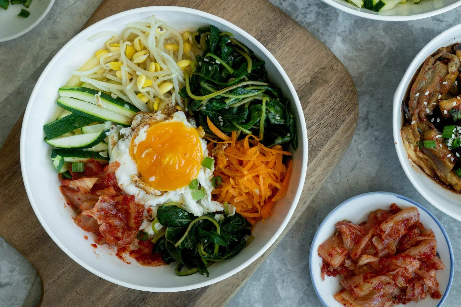
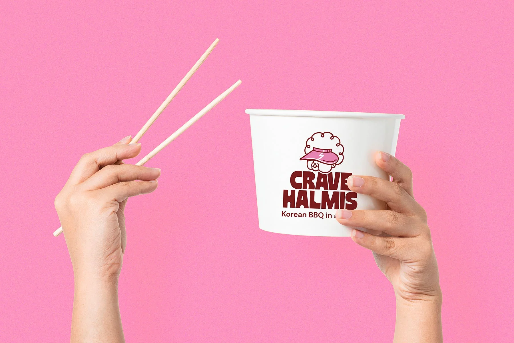
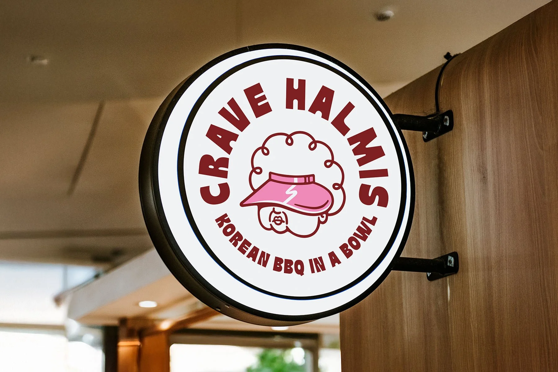
The result is a bold, personality-filled identity that gives Crave Halmis a distinctive presence in a crowded restaurant scene. More than just a logo, the brand brings a little of that no-nonsense, big-hearted Korean grandma spirit to every touchpoint, from packaging and signage to the overall customer experience.
It's an identity that's hard to forget, and just as full of character as the food itself.
Building the strategy before the identity
Before starting any creative work, we needed to get to the heart of what Crave Halmis is all about.
Reveal the personality that makes the brand feel like its own.
01. Getting to know the brand
First up, brand soul-searching. We kicked things off with a discovery workbook packed with prompts to get to the bottom of Crave Halmis' story, ambitions, audience and what the business wants to stand for.
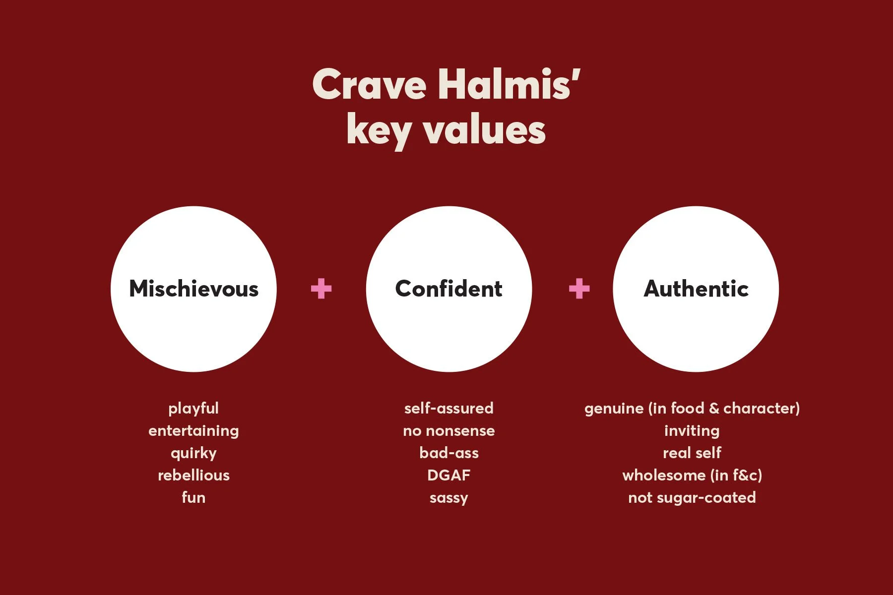
I then pulled together the common threads and distilled them into three core brand values, giving us a clearer picture of what makes the brand tick, what its personality is, and how we want it to come across.
02. Finding the Crave Halmi personality
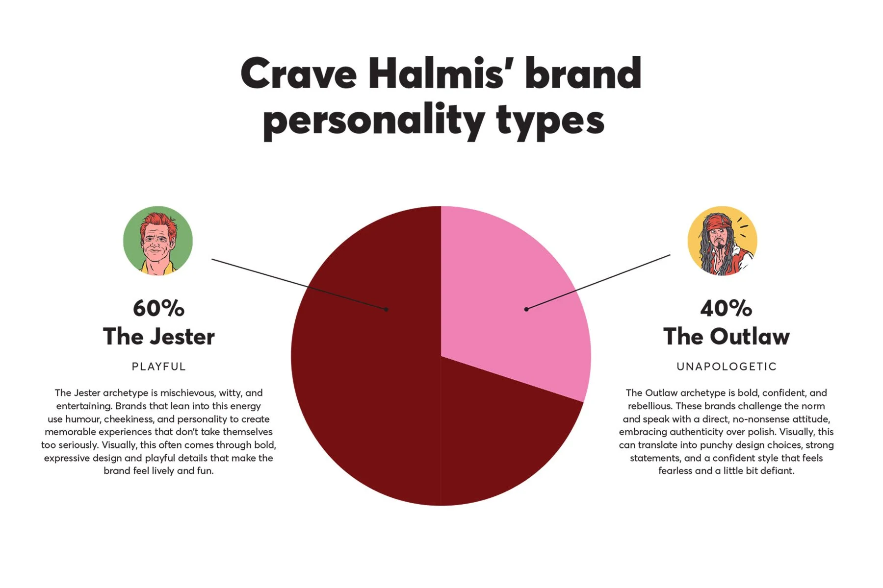
Next, we used brand archetypes to give those values even more personality. They help us picture how the brand would think, feel and behave, giving us a clearer idea of the character we're trying to bring to life.
For Crave Halmis, we landed on the Jester for its playful, mischievous side, and the Outlaw for its unapologetic confidence and do-it-my-way attitude.
03. Setting the visual direction
With the personality taking shape, it's time to explore how it translates into visuals.
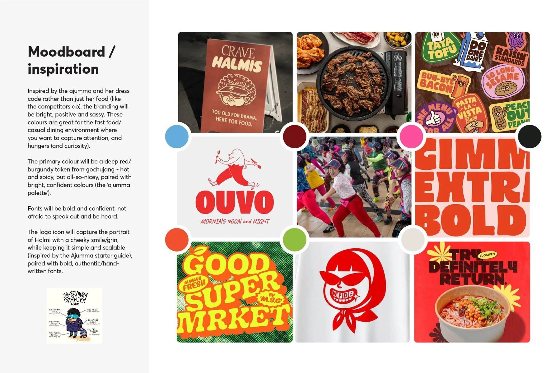
I researched and put together a moodboard exploring colour, typography, imagery and illustration styles that capture the Crave Halmis spirit.
This gave us our creative direction and a visual roadmap for bringing all that personality to life during the creative stage, while staying true to the brand’s core.
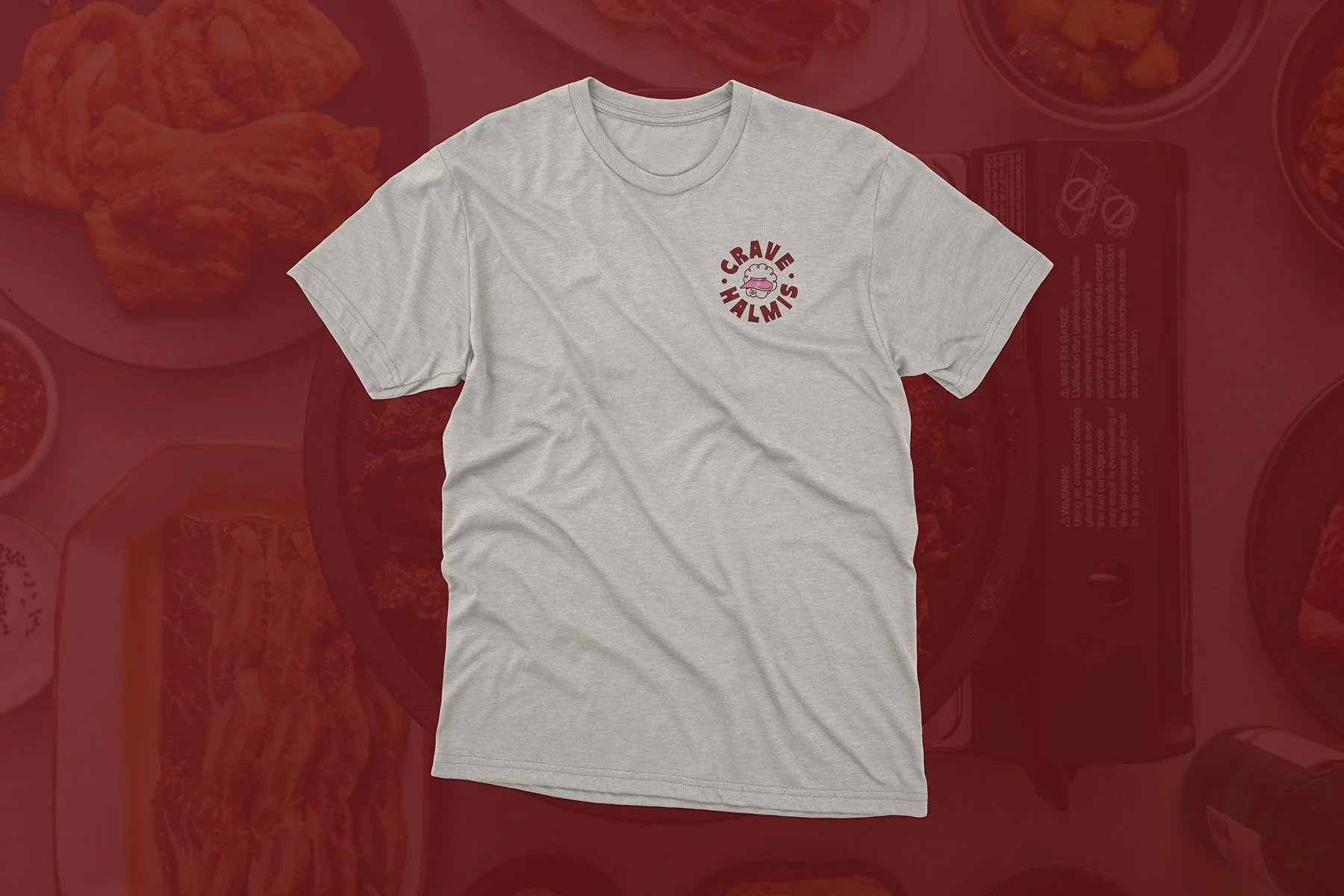
The logo development process
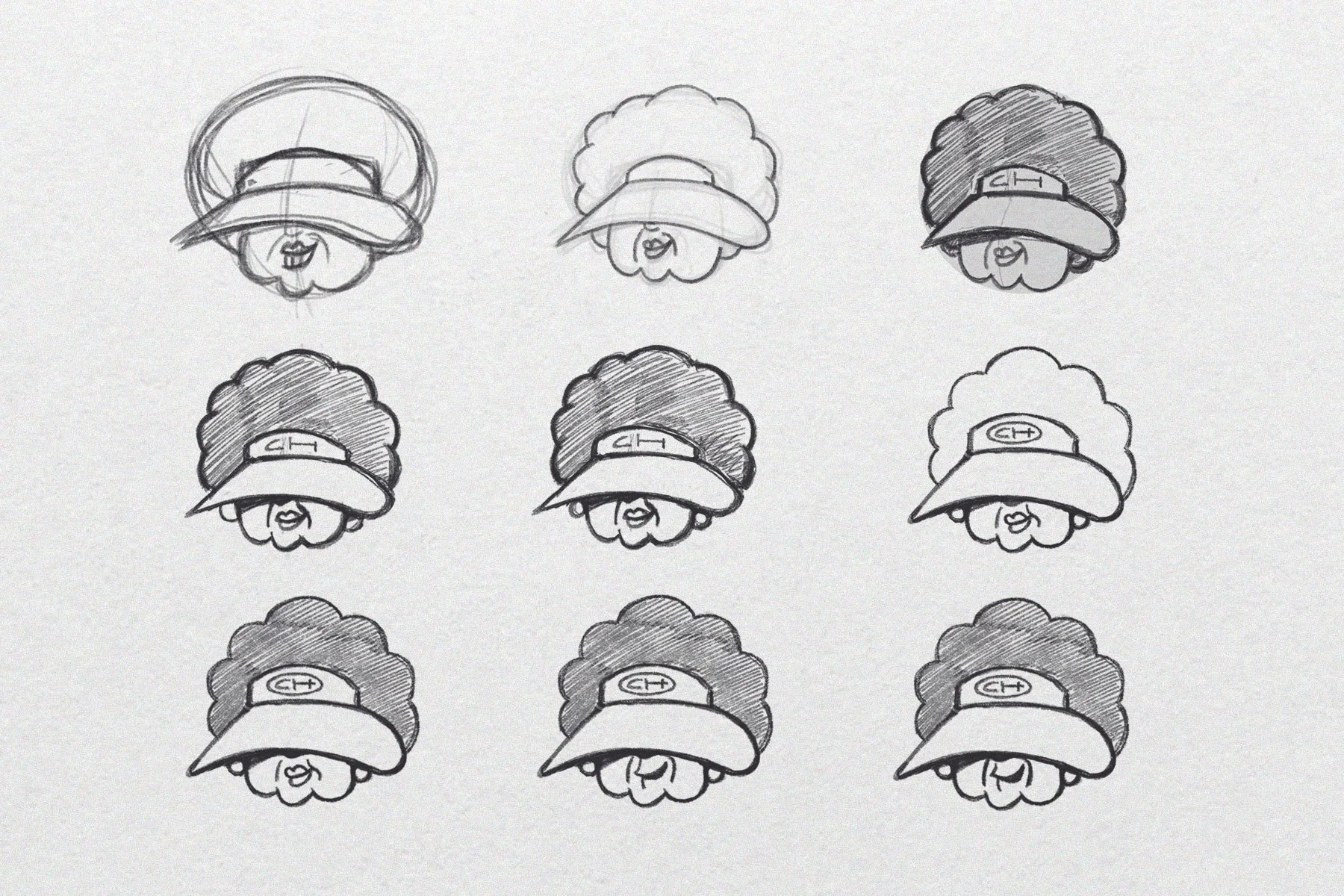
Initial logo sketches to develop a slightly different approach as an alternative direction. We ended up going back towards the original reference.
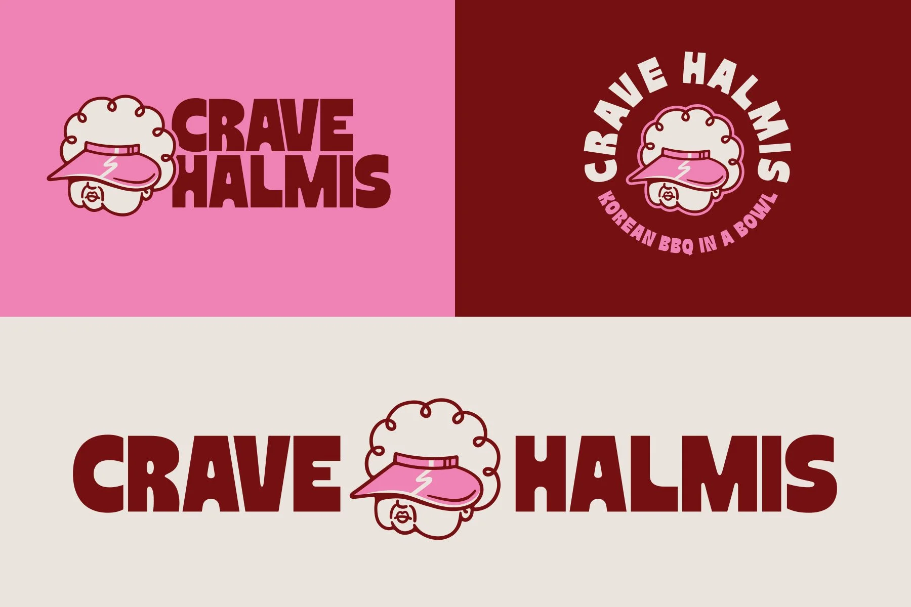
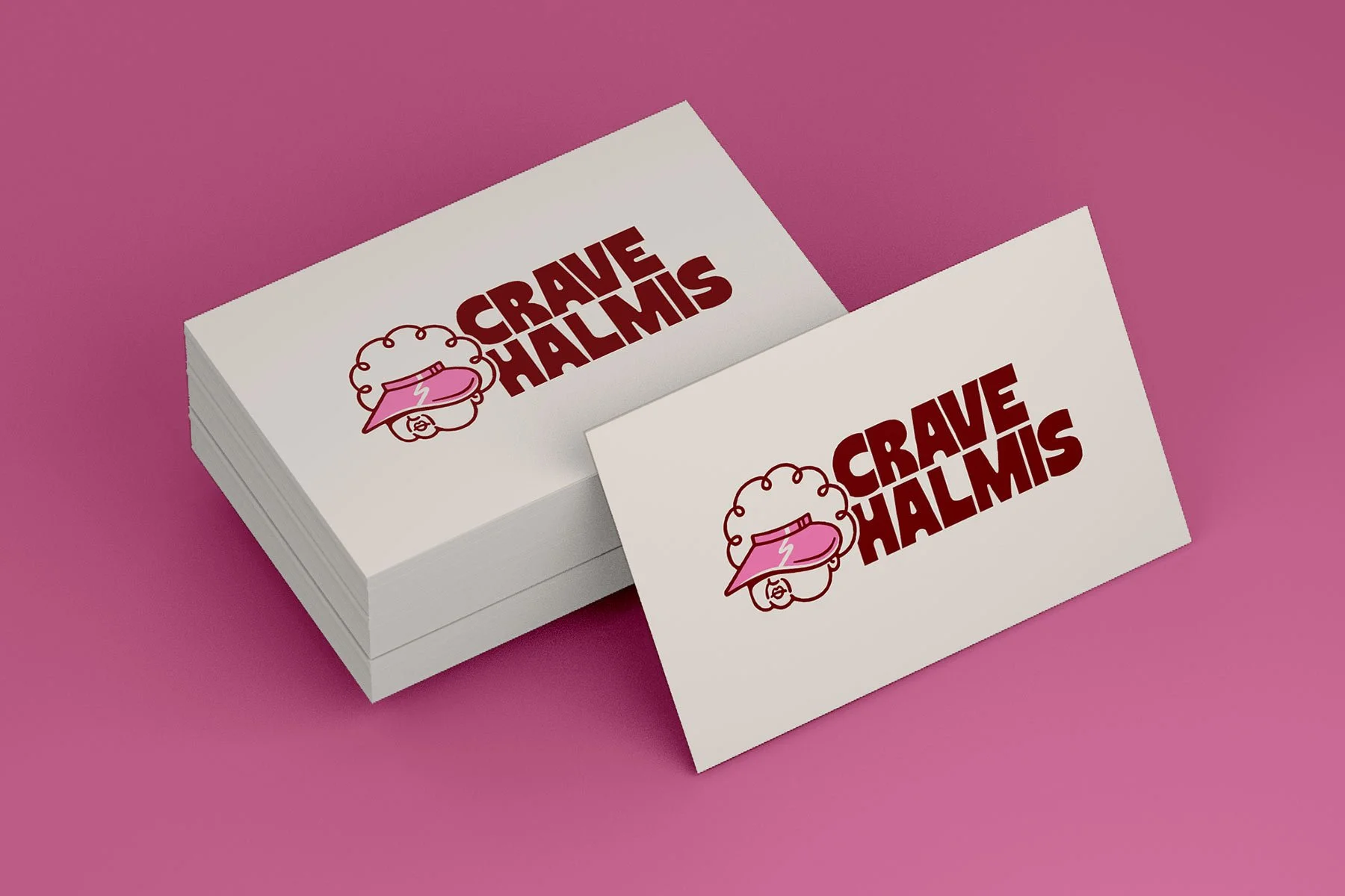
The final logo suite with different logo lockups to suit different spaces and uses.

“Amy created something memorable that communicates the heart of the brand with just one look. The final design captures the cheeky humor and personality behind Korean grandmothers while still feeling modern, memorable, and scalable as a brand.”
— Janice, Crave Halmis founder